Thursday, 5 May 2011

Evaluation.

How did you use media technologies in the construction and research, planning & evaluation stages?


What have you learned from your audience feedback?


Here is my Youtube Video, annotated with comments that I received after showing my Video to a focus group. Below is a Prezi Presentation analysing some of my Audience Feedback.


How effective is the combination of your main product and ancillary texts?


In what ways does your product use, develop or challenge forms of conventions of real media products?

USE:
Focus On Instruments: 
Screenshot from Amy Winehouse- Rehab.
I took inspiration from the video for Rehab by Amy Winehouse. I focused on the emphasis of the use of instruments, and the shots I produced featured close up views of the artist playing a guitar. I thought that Amy Winehouse would be a good existing artist to take inspiration from, as although not in the same genre as my artist, she has a constructed image to make her appear independent and creative. I feel these shots worked particularly well as they show the skill of the artist as a musician, which would be appreciated by the members of her audience who are interested in the technical side of the music.

Performance Aspect: 
The performance aspect was a large part of my video, and is a huge convention in the indie genre. I observed this convention in many videos, including this one by Gabriella Cilmi. I felt that the performance aspect worked well in my video, as it emphasized the talent and authenticity of the artist performing. The target audience of my video would notice and be appreciative of the fact my artist performed and played the guitar, and sang on screen, as they look out for the musical talent and unique creativity in artists of this genre. 

DEVELOP:
Abstract Narrative:

In this video by Paolo Nutini, I observed the use of a more literal narrative, which explained and acted out the lyrics. I decided to develop this convention, reading into a deeper meaning in the lyrics of my song, as there was not an obvious storyline that came to mind when simply reading the lyrics. I felt that this more abstract narrative worked particularly well in my case, as it invited the audience member watching to become more active and read between the lines to develop their interpretation of the narrative in their mind. 

Image:
Screenshot from Duffy- Mercy. 

The image I constructed for my artist was directly inspired by that of Duffy in the video for Mercy, as well as others. I took the ideas of her vintage inspired dress, long, blonde styled hair and high heeled shoes to create a vintage inspired and timeless look. By using this as the image for my artist, it has helped to create a look that directly links to female artists of the indie and acoustic genres, making it obvious to the audience where our artist fits in terms of music style. This retro, 1960’s era, inspired look also reflects the individuality of the artist and her music, which appeals to the audience. The styles of this era are popular with modern musicians as it was a time when music in Britain was at its prime and popular culture was taking off, with bands such as The Beatles, and influences from the fashion industry including models like Twiggy. You can compare these models, and stresses, specifically those such as Brigitte Bardot, with the style of Duffy, and similarities in their appearance and styling become obvious. The intertextual reference I used in the narrative was the artist's Blondie Tshirt. This gave a reference to the audience as what inspired the look, creativity and music of the artist. I think that this worked particularly well as it gave the active audience another artist to look to for inspiration for their own look.

 Dyer’s star theory suggests that an artist’s image is constructed for the purpose of audience appeal, in this case, Duffy’s image in created to appeal to the older generation who would remember when that sort of styling was popular first time round, as well as a younger generation who take interest in their parent’s background and inspiration from vintage fashions and music. By creating my artist’s image in this way,I have made her appeal to a wider audience, as her image is put into a context that would make her seem more individual and creative.

CHALLENGE:
Black & White: 

I decided to challenge the convention of having the entire video in colour, due to filming and budget restrictions. In this video, I observed the constant muted colour scheme throughout, that was able to be constructed due to the large budget allocated for the location and filming of the production. By desaturating my narrative footage in Final Cut Express, I was able to worry less about the colours in my filming, as they were not noticable after editing. I felt that this worked particularly well however, as it also helped to maintain the 'timeless' feel and was inkeeping with a vintage look, as it created an intertextual reference to classic cinema, and Hollywood, where starlet such as Marilyn Monroe were famous, who created huge style inspiration for the likes of Blondie, who later went on to inspire my artists style choices. 

 Use of Male/Female Stereotypes: 

To create the image of an independent woman, I challenged the convention of using Male and Female stereotypes. In the video above, I observed the fact that the female character appears passive, as she follows the male lead around, making him appear in control. This challenges the idea of Laura Mulvey's Male Gaze, that the female is purely there for the purpose of the male audience members to voyeur. I did this by including no Male characters in my video, emphasizing the individuality of the artist and making her appear that she does not need a man in her life. The lyrics also agree with this idea, and are emphasized by the fact that she is the only character in the video. I think that this is a positive message to portray to the audience members, as it gives inspiration to the young female members to be themselves and proves that they can be a strong, independent woman without a male influence. 

Final Video


Here is my final video, now on Youtube. 

Wednesday, 4 May 2011

Final Magazine Advert,


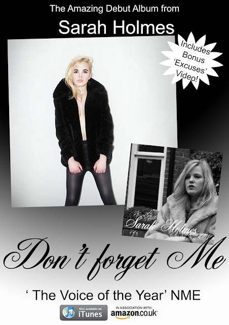
This is my final print Advert for my Digipack. I used the gradient effect on Adobe Photoshop to create the background, which is similar to what I used when creating the Digipack, maintaining a consistent image across my Ancillary Texts. I also did this by using the same font, colour scheme, and included an image from inside the Digipack, as well as the Front Cover, which would make it recognisable in a store to someone who had seen the advert. I included the quote at the bottom, as these are often used in advertisements for Music products, and chose NME as it is a hugely popular Indie and Alternative Music Magazine which would be recognised by the target audience. I also featured the iTunes and Amazon logos at the bottom as these are 2 popular Music buying services that customers would probably already have signed up to, making it appear easy for them to get this product. Overall I think that this advert is effective for my product and maintains a continuous image across my entire production.

Play.com Advert.

This is an advertisement, for Play.com as well as for the CD being advertised. I think that when I make my Magazine Advert, I need to take into account the distribution of my product, and how my target customers will buy it.

Cee Lo Green- The Lady Killer Magazine Advert.

This is the print advert for 'The Lady Killer' by Cee Lo Green. 
I really like the contrasting colour scheme between the background and the font as the colours reflect those in the image. Although my images from my Digipack are not similar colours to these, I think this shows how important it is to have an interesting colour scheme, and how it can look very effective. I also like the layout of this as the artist is the main focus, but the eye naturally progresses on to looking at the information below. I like the gradient effect at the bottom of the page, and think I should use this as inspiration for my Magazine advert as I used a gradient effect in my Digipack. 

Oasis- 'Masterplan' Advert.

This is a Digipack print advert for "The Master Plan" by Oasis. The overall effect of the advert is fairly simple, with plain fonted text and 1 image. The main focus is the name of the band and the image, suggesting the more important parts of the advert. The colour scheme reflects the image, with black and white, the flash of red emphasizes the name of the Digipack, so it would stick in the viewers mind to make them think about buying it. The small amount of advertising at the bottom informs the viewer where exactly they can buy the product, making it easy to access. I think that an advert like this, with a touch more creative flair would be appropriate for my artist.

Final Digipack.

I used various images of Ellena, my artist, and Adobe Photoshop to create my final Digipack, taking inspiration from Duffy's 'Rockferry' album for the Front Cover, and Katy Perry's 'Teenage Dream' Album for the inside pages.

                                     Front Cover                      Spine                      Back Cover


 Inside Pages: 

I used Duffy as inspiration for the outside covers of my Digipack. I really like the black and white colour scheme as it links well to my video, and paired with the font, creates a classic & timeless look. 
For the inside pages, I looked to Katy Perry for inspiration, creating a more edgy look, but still with a vintage, timeless look. I think that these pages would also appeal to the target audience for my artist, as the images look like photos for a high end fashion magazine, which would be popular with the young females in the audience. 


KT Tunstall- Eye to the Telescope Digipack.

This is the Front Cover for 'Eye to the Telescope' by KT Tunstall. I like this more creative and collaged-stlye effect on the front cover, as it makes the artist appear more creative and individual. I think that the image of the artist could be stronger, as she almost gets lost within the other busy elements overlapping around her. I think the muted colour scheme works very well, and creates a vintage look, and the use of the red, yellow & green being emphasized creates an intertextual reference to the Reggae Genre, and artists such as Bob Marley, who is a strong influence on many modern artists. This reference would be picked up on by audience members, and the musical knowledge of the artist herself would be appreciated.  

Katy Perry- Teenage Dream Digipack.

Here are some images from the 'Teenage Dream' Digipack, by Katy Perry. Inside, there are little words and fonts, allowing for the images to speak for themselves. I think that this is an effective digipack for this particular artist, as she is well established and is portrayed as an independent woman, and this would be good inspiration for my artist. I think that the more posed, fashion style shots look good on the inside of the digipack, and think I am going to use this idea when I make my own. 

Adele- Make You Feel My Love Digipack.


Front Cover for Adele's 'Make You Feel My Love' Digipack. This is similar to the cover for Rockferry by Duffy, due to the strong emphasis of the artist in the image. However, the colour scheme here is more interesting, and despite not being in black and white, still has a vintage and timeless feel as the colours used are fairly muted. I think that the title of the album also links to the overall look of the album, as the word 'you' and the way she is looking directly into the camera, allows for a strong message to be portrayed directly to the viewer. 

Duffy- Rockferry Digipack.

This is the front cover for the 'Rockferry' Album by Duffy. I think that this style of digipack would work particularly well for my artist, as she has a similar look to Duffy. The black and white colour scheme would also link to the black and white narrative in my music video, and the vintage, timeless look would also adhere to a major Indie convention. I also like the fact that the artist is the main focus of the image, but if you look closer into the background, you see the aspect of the train, which could symbolise a journey, moving on and independence which would also relate well to my artist, I think that this would be a good look to inspire my digipack when I produce it. 

Amy Winehouse- Back To Black Digipack

This is the front cover of the Back To Black Album, by Amy Winehouse. The overall look is very simple and understated, with no images, just text. The font is an intertextual reference to the Jazz music genre, from which her music borrows conventions. I think that this type of front cover would not be as appropriate for my artist, because the Indie genre is more about the look and style of the artist, and I think I could capture this more successfully by using images. 

Filming Done.

I have now completed the filming for my music video, and can begin the editing process. During the planned filming, I was concerned that I may not have enough raw footage to edit the video together successfully, so I filmed a set of footage of my artist, wandering through some trees, I think that this could look effective in my video alongside the main narrative and the performance aspect, as it adheres to the 'low budget look' convention of the Indie genre. 

Thursday, 7 April 2011

Filming Tomorrow!

The weather was very nice today, and is due to be similar tomorrow, which means that filming should be going ahead, i have now arranged final props and  costume with my artist, Ellena, and have allocated the time it will take to film the video, I am confident that filming in one day is a realistic goal, and think that this will be successful if everything goes to plan.

Tuesday, 5 April 2011

Filming Timetable.

I have arranged with Ellena to film this Friday Afternoon. We have allocated 5 hours to complete the filming process, and I believe that as long as we get straight into filming and have no technical issues, that this can be achieved. I plan to film the performance aspect of the video first, then the narrative aspect. I think I will need to film the performance aspect approximately 5 times, of the entirety of the song to ensure a wide range of usable footage when I come to edit the video. The narrative aspect can be filmed almost shot by shot as physical distance will have to be travelled, which can be matched to the footage. I think this will take approximately 3 hours to film, as I plan to film the same footage from various angles to ensure a diverse range of takes when editing. I am confident that weather-permitting, in this time frame, we can begin to create an effective final piece. 

Equipment List.

This is a Prezi Presentation listing all of the equipment that I will require whilst filming my music video.

Prop List.

These are the props I need to arrange ready for filming:

Narrative Aspect:
- Various Bags.
- Rayban Sunglasses.
- A Guitar Case.
- A Mobile Phone.

Peformance Aspect:
- An Acoustic Guitar. 

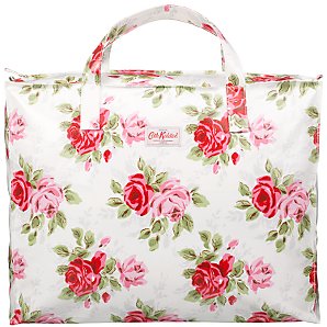
This bag is designed by Cath Kidston who is a popular Interior and Accessories designer. Her bags have reached huge popularity in recent years and feature endless amounts of vintage inspired patterns and florals. I think that bags by this designer and ones similar to this would be a good choice to use in my video as they are widely recognisable and will help to establish the creative and vintage inspired convention into my video. 

Rayban sunglasses are hugely popular and one of the most expected things for Indie artists to wear. I think that using these in my video will help to establish my artists firmly in the Indie genre. The fact that they are reasonably expensive, and will be one of the items my artist 'leaves behind' in the narrative aspect of my video will also help to confirm her strong minded nature, as it will make her appear like she makes decisions and sticks with them, and is careless to her feelings for the man she is singing about. 

I have previously blogged about the use of acoustic instruments in videos of this genre, and think that the use of it will make my artist appear creative and talented. Ellena, who is playing the artist in my video plays the acoustic guitar, so hers will be the one used in the video, which eliminates me having to source one. 


Dress Code for Video.

For the dress code, I have collected some garments together with Ellena, to use in the video. I have decided to adhere to the convention of the Indie genre of having a classic and vintage inspired look and I believe this is well reflected in the clothing choices I have made. For example, in the narrative aspect of the video, I have selected a vintage "Blondie" tshirt for Ellena to wear, as audience members will understand the relation to the classic music personality, and respect the musical knowledge that the artist in my video appears to have. The colour scheme of the clothing will be limited to neutral tones, with not too much detail, just well accessorized and stylish. 

Narrative Storyline.

I have decided to use a narrative in my video, as the videos I have previously looked at, I felt were particularly strong, including One Night Only- 'Say You Don't Want It'. I loved the movement in this video, and felt that the use of narrative which matched to the lyrics was extremely effective. For my narrative, I think that the artist needs to appear strong, and as if she is moving on from a relationship with the man she refers to as not being able to 'handle his excuses'. I think that this could be difficult without her coming across as bitter, so to make her appear as if she is leaving things behind and moving on, she will literally leave things behind throughout the narrative, for example dropping bags, and removing items of clothing as she is walking, to add movement. Here, I can include items that appear often in Indie videos, or are associated with Indie artists, such as Rayban sunglasses which I have previously blogged about. I think that this will portray a strong image that will make her seem like she is in control, appealing to the female members of the audience as she is dominant and knows what she wants, and appeals to the male audience members because she knows her mind, and the fact she is proving that she does not need a man in her life, making her a challenge to them.

Location Scouting.

I have been looking around the local area for potential places to film parts of my music video. I have found different locations that have a 'timeless' look to them, which is a convention of the indie genre. These include a courtyard with classic english flowers and benches, along with an archway leading to a long road, which goes underneath an old house, and has a classic english feel to it. By using locations such as this that do not look too 'set up', I will be sticking to the 'low budget look' convention of the indie genre. 

Potential Artists.

Here are 5 people who I am considering using as the artist in my video.

Hannah. 
I think that Hannah would be good, as she has long, natural hair, which makes her appear casual and relaxed, a convention that I am keen to stick to within my video. However, I feel that because she is fairly shy, it may be hard to portray her as a strong and independent woman. I think she would come across well on camera and has a natural look that I believe, members of my target audience would want to emulate. 

Nikki. 
I think that Nikki would come across well on camera as she has an extremely photogenic face, and also has a strong personality that I believe would shine through. Her natural eclectic style could be taken advantage of, with the addition of some of the key features I have picked up on in Indie dress codes. 

Hollie. 
I like Hollie's natural, long hair, and think that she would come across on camera as something to be desired. She is a very good actress and I think she would be good at playing he strong female role, however she is fairly young, and think that this could come across differently and make her seem quite vulnerable.

Ellena.
Ellena is petite, which is something that I had not picked up on when looking at female Indie artists. She is a good actress, and has a naturally strong personality, so I think that on camera she would come across very well. I think her features are very photogenic and that fact she has long, bleached hair could be useful to me, as her look is naturally inspired by existing female artists such as Blondie and Madonna. This could work in my favour and combined with some of the conventions that I have studied, I think that she could come across of having the vintage inspired look very well. She also plays acoustic guitar, so would be able to make it appear as if she is playing the song throughout the video, which would add a huge deal of authenticity. 

Mollie. 
Mollie has a very approachable feel, which I think could work very well in my video, as Indie artists often appear as having an achievable look. I think her features and stature would come across well when paired with a vintage inspired look, however I believe that she may come across as vulnerable on camera and not as strong and independent as the song suggests. 

I am going to use Ellena in my final video as I believe that I could create a strong image for her to have through the use of dress codes. The fact that she plays acoustic guitar will help to add authenticity to my video, as this is such a huge convention of the genres I am exploring I think that is important that this comes across as well as possible on camera. I am happy with this choice and I believe she will make for a very effective final video and digipack. 

Planning for Video.

I am now going to begin the planning stage for my final video. In this stage I need to:

- choose an 'artist', someone who is comfortable in front of the camera, as can act a strong, independent female image on screen, I am going to find several people that I think would be appropriate and then decide who I am gong to use.

- choose locations to film my video at, these need to fit with the vintage 'timeless' conventions of the Indie genre and be places where filming is allowed to take place.

- do a health and safety risk assessment to ensure my filming runs smoothly and effectively.

- construct an image for the artist through the use of mise-en-scene and dress code. I have studied dress code in depth, so am confident that I can construct an authentic looking artist to suit the style of the song.

- arrange filming dates with my artist, and prepare all costume, props and equipment needed.

- complete a storyboard with ideas of shots for the entirety of the video, taking the lyrics into account as I do so. One thing that I learnt from my original coursework, is that sticking exactly to the planned storyboard is not always possible, as it isn't until you have the raw footage that you can exactly select the shots you are going to use, as sometimes the lip syncing, camera angle/movement, facial expression,  or lighting isn't as you imagined/high enough quality or does not fit the overall look you are going for.

- using the lyrics as a basis, construct a story or plot to run through my video in the narrative aspect.

Thursday, 24 March 2011

Florence & The Machine- 'You've Got The Love'.


This is the video for 'You've Got The Love' by Florence And The Machine. Although this video is performance based, elements of a motif are incorporated. There is a theme throughout of night time, and the sky, which is identified in many different ways. Obvious representations of this theme include the giant sparkly Moon she is performing on, and the use of the stars footage to end the video, but there are lots of more sublte references to it. Her costume features a nude coloured leotard sprinkled with sequins, which look like stars, and use of lighting is cleverly done in a style to make the spotlights look as if stars are shining down on the artist performing. I really like the uplifting, enjoyable mood of this video, the use of lighting and props make it contempory and interesting, but the costume for the artist, and the people dancing below are obviously vintage and retro inspired. Overall, the use of quirky and kooky colour schemes, costumes, props and lighting reflect the individuality of the image constructed of the artist and would appeal to the target audience as it shows ways of being unique and creative to create a stong sense of empowering femininity. If I decide to go ahead with the star motif, I think I could take inspiration from the lighting used in this video, as the spotlights are used to achieve the look of stars against a night sky, and the props used, such as the falling confetti, which highlight the motif throughout.

Ellie Goulding- 'Starry Eyed'


This is the video for 'Starry Eyed' by Ellie Goulding. I was looking for music videos of artists similar to Sarah Holmed, which feature a motif when I discovered this one which uses a star, like I had considered doing. The motif is not used the whole way through this video- and is often seen just at the points when the lyric 'Starry Eyed' is repeated. It is incorporated by the use of star shaped sequins all over her palms, and the use of superimposed footage over the top of her performing. I think that these techniques of incorporating a motif are effective in this video, except I think it could have been used in other parts of the video, as using it alongside the lyric 'Starry Eyed' appears a little obvious and naive. I think it could have featured in the other performance scenes of the video without looking overused and obvious. When applying a motif to my video, I think I need to take into account that it should be used enough to be noticed, but at the right times in the song, and not too much as though it appears obvious and over thought. Ellie Goulding and this song are more in the Pop genre, and I think that the overall of effects used here (such as Chroma Key Green Screening) could be too high budget looking for my video, although I could use this technology (in Final Cut Express) I think that due to a convention of Indie being the 'low budget look' this could be too modern looking as an effect.

Star Motif?

I am considering using a motif in my music video of a star. From looking at the lyrics for the song, I think a star as a motif would be effective a increasing relevance linking between the video footage and the lyrics. There are many aspects of mise-en-scene that we could use to incorporate the motif. However, obvious motifs are not hugely used by artists of this genre, so I will have to decide whether to use or challenge this convention.

Costume.
I could use star print clothing items to incorporate this theme into my video. From previous research, I have picked up on the fact a convention of this genre is unique, retro and vintage inspired clothing, which adds to the creative and individual image constructed for the artists.
This cardigan is from Miss Selfridge and features sequinned stars on the shoulders. It is obviously inspired by vintage fashion, due to the use of gold sequins, the style of the buttons and the colour of the knit itself. A piece like this would be effective in the video, but I feel the star motif may not be obvious enough to the viewer, and a stronger print may be better to use.

Make Up.
The use of make up in my video could be key in determining the look we are constructing for the artist. Make up is an easy way of establishing a particular image, natural pallettes would create an entirely different look to vibrant clashing ones, and retro-inspired make up could emphasize the creativity of the artist which is reflected in the clothing choices and music.
This image from Cosmetics Box uses bright vibrant shades to create a clashing, youthful look. I do not think this style of make up would be appropriate for my artist, because it is not a particularly retro-inspired  look. The use of the star motif in this image could however be used in my video as it is obvious to the audience enough, without being naive-looking, or a more subtle use of a star like this could be used. 

Another way I could use make up to emphasize the star motif in my video could be through the use of tattoos. Many female singer/songwriters and artists have tattoos on show in their videos or promotional material, as it helps to add to the 'girl power' ephos they stand for, and emphasize their creativity and youthfulness.
The use of a simple black star like in the image above, could be an effective way of incorporating a star motif into my video. Due to the fact the artist will be playing a guitar in the video, I think a good place for such a motif would be around the wrist or hand area as it would be seen by the viewer, yet appear subtle. I could easily use make up to replicate this look, and I think it would be effective in my video to do so.

Props.
Another way I could incorporate a star motif into my video is through the use of props. The image below from Moonbed is a hanging star decoration featuring small lights. I could use multiple decorations like this, hanging in clusters above the artist to create a unique looking setting to perform in. I think use of props like this would be extremely effective in my video as they would reflect the lyrics well, and would be versatile in what I did with them, for example, we could feature them falling, or moving to add animation and movement to the video.

Sarah Holmes 'Excuses' Lyrics.

Here are the full lyrics to the song I am using for my music video: 
I've lost the use of speech, 
so I will sing for you instead, 
I know that look in your eyes, 
counts for nothing, against me.
'Cause you said there would be fire, 
when I was caught up in your head, 
but I refused to play your game, 
so I left for home instead.

But the scars are just stars,
That you burnt, and you hurt,
When you said all of those things, that you
Say you didn't mean.
But you lie when you're looking at me...

And it goes,
Meaningless, won't count for this,
Won't make enough excuses.
Talk for this, I won't stand for this,
Can't handle your excuses.

If I had to draw the line, 
I would make it all worth while,
I would get something from this, 
if it would help me figure out.
But when your cannon fired, 
you took my plastic soldiers out, 
if I knew you'd shoot your gun, 
maybe I'd put your fire out

But the scars are just stars,
That you burnt, and you hurt,
When you said all of those things, that you
Say you didn't mean.
But you lie when you're looking at me...

And it goes,
Meaningless, won't count for this,
Won't make enough excuses.
Talk for this, I won't stand for this,
Can't handle your excuses.

If happiness was served on a plate,
You would've had it long ago.
But you couldn't find your own,
So you took all mine instead...

But the scars are just stars,
That you burnt, and you hurt,
When you said all of those things, that you
Say you didn't mean.
But you lie when you're looking at me...

'Excuses' Ideas.

Here are two spider diagrams of ideas, that me and a friend wrote down when listening to the song I am using for my video, I think this technique was effective as it made me think about the song in terms if an overall finished product.


Location Ideas.

Below are screenshots from various music videos by similar artists to Sarah Holmes: 
This shot uses contrast between the artist and the location to make her stand out. The location is an outside setting, with a stone wall covered in feminine, pink roses in the background. The use of this setting tones the sexual themes down in the video and adds a sense of girlyness and innocence. This appeals to the target audience of this artist as many of them are young girls (below 18) who look up to the artist as a positive role model, so she would not want to be accused of glamourising sexual themes to such a young audience. However, the sexual nature of parts of this video, including the costumes seen in this shot appeal to the older female members and male members of her target audience, because they enjoy watching her dressing and acting in this way.


In this shot, the band members are seen singing the song, whilst sitting on a bench. The outside, night time, location reflects the lyrics 'beneath the milky twilight' which is sung throughout. The use of this location and the way in which it reflects the lyrics adds relevance to the video and the song, as they fit together so well. I think this technique is something I could potentially look into to use in my video as it adds a sense of narrative which appeals to the audience as it increases their understanding of the lyrics.


Performance is a key part in this video, the location we see here is similar to that the whole way through the video. The dark background allows the main focus to be on the artist throughout, by contrasting with the lighting on her, and her pale skin. I think I could use a similar location to that in this video in mine because it allows the artist and the music to 'speak for itself' and stand out, without too much confusion or fussiness in the background.


In this shot we see the artist performing from inside a retro-style caravan. The use of vintage and retro-inspired clothing, locations and props is a popular convention in female singer/songwriters because it makes them appear individual and creative, which reflects their music. I think I could take inspiration from some of the vintage and retro style things I see in other music videos to give my artist a sense of creativity and uniqueness.


This video, like the previous one by KT Tunstall, focuses on performance as opposed to a strong narrative. The location used appears to be a type of dance hall, with strong lighting to emphasize the artist performing in the centre. Again, this video has a retro style to it, due to the muted colour scheme and styling of the artist, which reflects her vocal style which is often compared to that of Dusty Springfield.


Again in this video, retro and vintage-inspired themes play a huge role in the overall style of the video. This reflects the quirky and individual lyrics and musical score of the song as well as the personal style which has been created for the artist (Dyer's theory states that an artist is constructed in a particular way to appeal to the audience, this retro style makes the audience believe the artist is genuinely unique and creative in her style). I think this quirkiness and individual sense of style would be good to look into for my music video as it would highlight the creativity of our artist, which would appeal to the audience.

Star Theory & Construction of Image.

Dyer's Star Theory proposes that:
A star is an image not a real person that is constructed (as any other aspect of fiction is) out of a range of materials (eg advertising, magazines etc as well as films [music])
 I believe that this is particularly true in Music and Music Video, as you are not just creating a Video, you have to contruct an artist's brand (a good example of this is Lady Gaga, as her image is obviously constructed to put across her creative ephos to the consumers, but it is constructed constantly, you never see her out of one of her over-the-top creative outfits. In her case, if she became her creative alter ego on stage, then spent the rest of her time dressed casually, the media would pick up on this, and she would appear fake.) In the Indie genre, artists typically look casual and unaffected by current fashion trends, however, it could be questionned that by dressing in a non constructed way, artists of this genre are just as much creating a constructed look. This could also be applied to the image of some of the videos in this genre, as often they have a 'low budget look' when actually a huge amount of money has been spent on the video to make it look cheap.

Katy Perry- 'I Kissed A Girl'.

Below are screen shots from the video for 'I Kissed A Girl' By Katy Perry

In this first shot, we see a close up of the artists' legs laying on a bed. From the beginning of the video, the artist is sexualised to the audience, with close up shots of parts of her body. This would appeal to the male audience viewers, who enjoy looking at her body, but also to the female audience members who look up to her, and aspire to look or be like her. The use of the muted shades create a girly and innocent feel to the shot, which is later contrasted. 

In this shot, we again see the artist lying on  bed, which immediately creates a sexual atmosphere. The muted shades seen before are now contrasted with her dark hair and the red cushions, which again add to the sexual feel of the video. The use of the toy bunny as a prop in the bed brings out the girly, playful and innocent side to the video and the artist. This ensures that the video is not entirely sexual, but remains with a innocent side to make it appeal to the younger viewers. 

In this close up shot of the artist's face, the use of sight lines create a flirty and sexual mood. Throughout the video there are countless shots of the artist looking directly to the camera. The effect of this is that the audience becomes drawn into the video, and are made to feel like it is them she is singing to. 

This shot is contrasted to the earlier ones, as now there is a much more sexual feel to the scene. The artist is shown in black lingerie, along with a group of girls dressed the same. The dark lace of their underwear is contrasted to their pale skin, and the pretty, girly roses and flowers on the wall in the background. 

This is one of the final shots of the video, and show the artist in bed, next to her boyfriend (reference in song 'hope my boyfriend don't mind it'), waking up from the dream in which she 'Kissed A Girl'. This twist at the end makes the video appear comical and emphasizes the fun, playful side of the artist and her music.